
Before you slap a visualization tool on top of data, it has to be organized. If things are organized, you can ask yourself questions about the aggregate data set.
Such as when I ask my four year old daughter to “count how many striped socks daddy has”. She promptly opens my sock drawer and I hear “11” in her ever so cute voice. Yes, I have 11 striped pairs of socks. And I know that because? They are organized (as good as socks can be).
But so much so that my 4 year old can count them. (And now you also know that I am the type of guy that has an organized sock drawer. Don’t judge!)
Some of us have no shot at making it that easy because our socks are unmanaged. Lost, mis-matched, old, holey and now that we are at it, this does not even look like my sock. Our business data is no different than a sock drawer.
If you are an operations person and wondering what your team is spending all their time doing, it’s a fair bet that 80% of their day is data organization. Preparing and harmonizing data.
Say you work for a nationwide retailer and want to know which region is showing the largest growth in margins, but your data is only at the zip code level. Somewhere you need to ‘map’ zip codes to regions before your data hits the business intelligence (BI) tool. Then for each region you may even calculate different commission schedules.
That’s Data Prep
Say each retail outlet sends you data independently in different formats with different fields and values and you have to bring all the inputs together to analyze.
That’s Data Harmonization
Data prep and harmonization are requisite steps to organizing data into a common ‘rectangle’ that can then be sliced and diced to reveal insights.
False Data Prep / Harmonization
Scalability and future ready is the name of the game. These simple examples are table stakes. Aliasing values and simple blending of data is just not enough. Today’s users need more.
I’m going to take this moment to plug our presentation at Tableau Conference 2019 in November. It showcases every pitch/play in the MLB regular season in a beautiful Tableau viz using Data Prep and Harmonization in K3. We’ll walk through the dirty details with low/no-code tools in K3 and show you how to put the controls in the hands of those who know the data best.
If you prepare your data well then, you get to ask questions like…
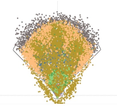
Why does this spray chart of every hit look like the hand of a 3 toed sloth?
We’ll be showing off the possibilities as a sponsor of Tableau Conference 2019 next month. If you are attending, please bring your data stories to booth 845.